Make Shit Happen (MSH)
A nonprofit movement for millennials to complete 5 minute social change tasks from their phone during their idle time (e.g., riding in an Uber or sitting on the toilet!)
Timeline & Role
Jan. 2020 - August 2022
Founder/CEO and Head of Design Team
What I Did
Research
UI/UX
Branding
User research
Design System
Project Team
Chris Shaw (UX Design)
Fasiha Iqbal (UX Design)
Maithe Van Luijk (Branding, UI, Design System)
Sankar Natarajan (Website Design)
Thea Pajunen (UX Research)
Luke Redmond (Eng)
Bennett Bierman (Eng)
Jonny Chang (Eng)
Global Team Map

Background
Problem statement
High school, college, young professionals (ages 16-35) sincerely want to volunteer and give back, but don’t have the time and don’t know where to get started
This demographic is also addicted to social media and often spends 5+ minutes wasting time while on the toilet scrolling through Instagram/TikTok/Snapchat/etc.
Hypothesis
An app that allows people to do something in under 5 minutes or less from their phone will enable our target audience (16-35) to volunteer. And making this app be at the top of users’ minds during a specific and niche part of their day (the bathroom) and somewhat addictive/fun (groups & points) will entice users to use it multiple times a week, if not daily
Why Aren’t Millenials Volunteering?
According to Australian census data, only 30% of millennials have undertaken voluntary work in the past 12 months. Meanwhile, the property-hoarding Baby Boomer and GenX parents are leading the charge of goodwill, with more than 40% of them donating their time. So, for a generation that is so passionate, so ethical, and so driven by purpose, why aren’t they volunteering?
The standard volunteering model is still based on the very same career model that millennials are leaving in droves: turn up, do a job, go home, come back and repeat indefinitely. It’s a model that works for Boomers and some GenXs, but like it or not, Millennials aren’t comfortable committing to a long-term working arrangement for their career!

Millennial volunteering trending down (source)
Research
I did a “hacky” user-test with 15 friends from college. Every day for one week I sent them a link to a Google Doc filled with tasks. I reminded them twice a day that whenever they took their next bathroom break, they should open the link and fill out a task that interested them. At the end, I had them honestly fill out this Google Sheet at the end of the week to see how it went.
Insight #1

People completed on average 4 tasks per week
This data may be skewed by the fact that they were all my friends, but I also factor in that a Google Doc and text group chat is not a very enticing or elegant way to complete tasks
Insight #2

Overall, people felt productive when completing these tasks and so that is most likely the void they are looking to fulfill with this app
Most people did not think they were making a difference. This means that the tasks needed to be much different and more meaningful to people
Insight #3

Notifications are key!
Most people did not do the tasks when I didn’t remind them and so we need to find a strategy for how and when to remind our users
Users
Based off of the feedback from the entire survey, I made some general observations below that will help clarify how our user persona/target audience feels.
Goals
Help others in a meaningful way while feeling good and productive about themselves
Being able to choose which category of social cause to help
Constraints
Only have phone in bathroom
Don’t have much time to help others
Don’t want many sounds (like having to play a video from the bathroom)
Frustrations
Not remembering to do a task, or the content when they do complete one
Having to change their bathroom habit
Currently not satisfied from their usual social media scrolling routine in the bathroom
Values
We first each created a few “lightning demos” of other apps. The goal of this exercise was to explain what concepts we wanted to keep/leave from other apps, as we start to think about our own.

We then thought about how we wanted our users to feel and interact with our product and what voice we wanted to carry through our designs:

(Red stickies are the most important idea for each category)
Value Prop
Make Shit Happen provides something to do on the toilet that’s more fulfilling than mindless scrolling. A Helper’s High in no more than the time you spend in there.
When the status quo needs to be broken, we get to the point to take action, creating a community of driven people — that take their phone to the bathroom — leaving them excited for their next shit
Questions
Can we facilitate as much change as possible in as little time as possible?
Can we avoid abandonment?
Can we increase the time spent in the bathroom?
Design Guidelines
Get to the point. We’re not here to waste time
Make it fun. We’re trying to get them excited about *actual* shit
Remove steps. Think: How can we keep people on the toilet *for shits and giggles*
Connect, respond. A community flows both ways
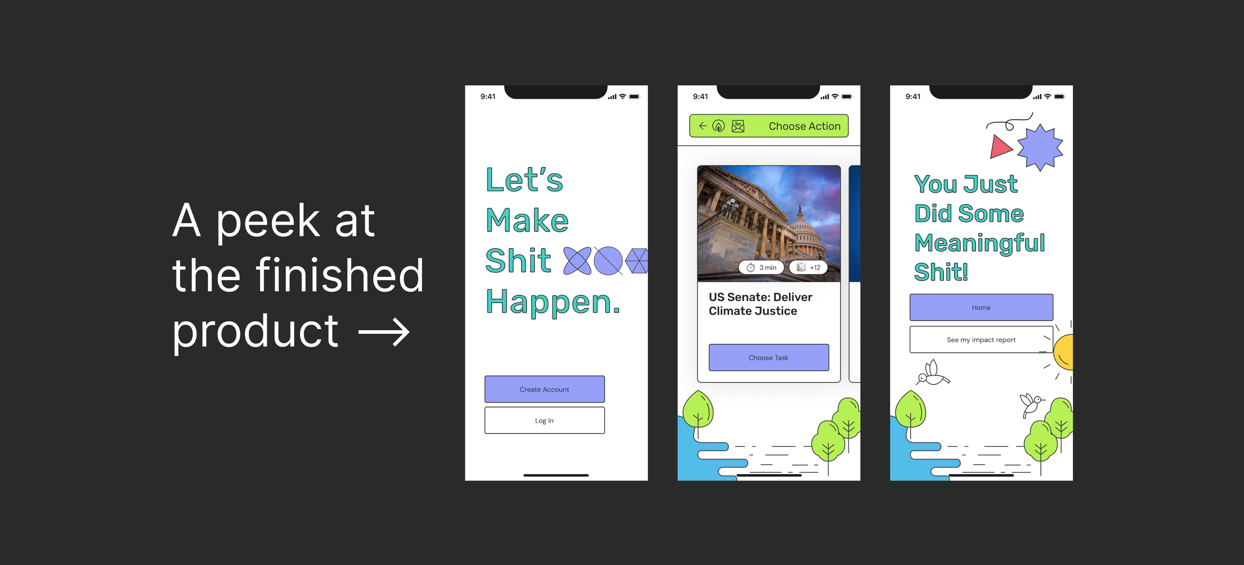
Design
Touchpoints - Mobile App & Website. Future concept: Email newsletter.
Wireframes - We first had a Miro brainstorming session on what we thought the app architecture should look like from start to finish. Afterwards, we transitioned to Figma to start building these basic screens. Each round we debated and explored different options of how data could be displayed and what the app architecture would be. We ultimately decided on 3 pages: Home/Tasks, Groups & Impact.


First Design Iteration

Biggest pieces of feedback (from design friends):
Looks like Halloween colors!
The images in the onboarding flow look like buttons/clickable
Can do more with the home page (looks very empty)
Back arrows shouldn’t be at the bottom, move to the top (2nd to last screen)
Second Design Iteration

Biggest pieces of feedback (from team):
The task cards don’t look right, and they can also be elongated
Is there a better way to display the instructions for each task
Does it make sense to go from light to dark screens? Also the buttons should be consistent from screen to screen.
Does settings need to be its own page?
Third Design Iteration

(the onboarding and trivia screens stayed relatively the same and were left off of this screenshot above)
After many more months of ideation, design critiques, and branding sessions, here is our latest look below & Figma prototype.

Design System
We created a design system to make our Figma screens easily changeable with components/styles. This allowed us to be consistent with our designs across the entire flow.

Branding
This is a vital part of our product because of our name and attention to the bathroom. I chose the name Make Shit Happen because it was memorable, positive, and pertinent to our mission. Yes, some people will be neutral and many will hate the name and never even click on it because of the language used. But many will love the name and remember it vividly as they go throughout their day and tell their friends, family, co-workers, and followers. We don’t need to appeal to everyone!
We started by each doing some research into brands across the internet that have a similar message/target our 16-35 user age range.

Then took these images, ideas, colors, etc. (and more not showing) and positioned them on a large mood board venn diagram. We chose their position based on brand, UI, graphics, education of users, sense of community, and tone of voice. And the center of it all is “Bold”; our main branding word that we defined above in the “Values” section.

From here we used a lot of these elements to build out our design system, but the rest of the branding portion of MSH (social media, graphics, merch, etc.) is also a work in progress!
Learnings
Beside the design learnings (a lot of which I have mentioned in the above sections), I have learned a tremendous amount about how our design relates to business and how to work cross-functionally with my co-founders who are leading the engineering efforts. Some brief bullet points below of some top level ideas I learned/have to think about:
Social Enterprises we are partnering with
SEs have told us they want their logos, or some recognition on the tasks that they provide
What’s the best way for SEs to give us the information for each task?
How can we visually show each SE the impact that our app is having on their organization?
ENG team
Some designs are not scalable! The last iPhone screens shown above have a geometrical pattern. My co-founder told me it wouldn’t be very scalable to code a different screen for every geometrical pattern with every type of task that a user could choose.
How can we allow charities to give us the steps to complete their tasks and have it display it on the app in an efficient and visually appealing way?
How can we track data across the app and show our users the impact they are making for each charity?
They consistently ask me how the interaction of certain functions will look like (e.g. when a user clicks “next” on the onboarding screen, will the screen swipe across or instantly switch to the next?). I need to be better about proactively protoyping in Figma for the ENG team to see what the design team is envisioning